Opening day for the MLB is here, and with it, the most important part of every season: the jerseys. After all, it’s not the wins nor the losses but the jerseys – especially the home jerseys – that make or break a team.
Because these jerseys play such a pivotal role in the sport, it seems of great importance to ask: Which teams have the best jerseys? Which teams have the worst?
I have answers to these questions. They are entirely subjective answers/rankings that follow no set criteria, and instead, are only what I think looks good or doesn’t. But, nonetheless, here they are:
30. Arizona Diamondbacks
The Diamondbacks got new jerseys this year, which don’t improve anything. There’s a weird color fade on the shoulders, the logo looks like it was made for a class project and the lining around the sleeves and collar makes it look like the player wearing it is bleeding. Blech.
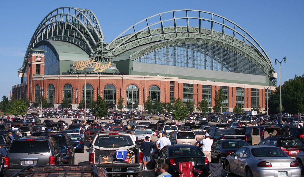
29. Milwaukee Brewers
Our first stop on the “Boring Jersey Express” leads us to the Brewers, whose jerseys induce sleep. Not only are they too simple, but the font on the back for the players’ names reminds me of “The Great Gatsby” for some reason. Not what you want when watching baseball.
28. San Diego Padres
The “Boring Jersey Express” rolls on to its next town: San Diego. A logo cutting across lines is never a good look, especially when instead of using the neat-looking SD logo, the team decided to use the entire Padres wordmark. A letdown, to say the least.
27. Oakland Athletics
Yellow and green? Who decided that was a good mix for a uniform? Oakland’s uniforms are as uninspiring as the stadium that they play in, and hopefully, like the stadium, they’ll be torn down soon.
26. Los Angeles Angels
Nothing irks me more than team names stretching from one side of the uniform to the other, and the Angels, of course, feature just that on their uniforms. They also have the number on the front of the jersey – which could be a good idea – but the spacing puts the number on the player’s bell – which is not a good idea.
25. Colorado Rockies
Take everything that I said about the Angels, throw in a bad Yankees knock-off jersey, and you’ve got the Rockies uniforms. Also, the pinstripes are purple, and that’s gross.
24. Cleveland Indians
Thankfully, the Indians don’t have numbers on the front of the jersey, but they do have the logo stretching from one side to another. And that’s it. The jersey is so painfully boring, which I guess is fitting for the city of Cleveland itself.
23. Miami Marlins
I never know if I’m going crazy, or it’s just the Marlins uniforms making me see double when I have to lay eyes on them. The black and orange color scheme is reminiscent of Halloween, which, in the middle of June, is a weird thing to be reminded of.
22. Tampa Bay Rays
The Rays uniforms are so similar to the Indians that it seems like they are evil twins. But at least the Rays logo reflects the spirit of Florida – something that the Indians logo does not.
21. Atlanta Braves
Two simple words: too much. The stripes and the logo clash, especially because the two are exactly the same color. The colors themselves are a good mix, but it all just proves that there can be too much of a good thing.
20. Kansas City Royals
Another boring uniform, this time mixing the worst of the Indians jerseys (the bland) and the Angels jerseys (the front number). Thankfully, the Royals’ royal blue color scheme works better than the Angels blood red.
19. Minnesota Twins
The Twins logo is a good-looking logo, and the color scheme and striping on the sleeves of the Twins jerseys are really nice touches. However, the logo is too large – so large it seemed to have blocked the designers from noticing that the team’s secondary logo would work perfectly as a smaller, right-breast logo instead.
18. Chicago White Sox
While the White Sox don’t have the logo stretching across the entire front of the jersey, the black pinstripes are too reminiscent of the Yankees for this jersey to be anything more than fine. If the Yankees had player names on the back of their jerseys, there’d be almost no way to tell a White Sox and Yankees player apart.
17. Texas Rangers
In a move that perfectly fits the state, everything is bigger on this jersey. The logo is huge across the chest, the number on the back seems gigantic, and the colors pop. Overall, it’s a decent jersey that’s weighed down by the use of a real baseball hat instead of a cowboy hat.
16. Toronto Blue Jays
Canadian teams should have their jerseys covered with an extreme number of maple leaves. The Blue Jays do not do this. The bird logo on the front has a maple leaf, though, which is a nice touch. It would look better if it was higher, but otherwise, these jerseys are alright.
15. Philadelphia Phillies
Red pinstripes and numbers on the sleeves: Two great additions, especially because the logo has an outline that doesn’t blend in with the pinstripes. The font for the player numbers, however, looks too childish to be taken seriously.
14. New York Mets
The Mets used to have cream-colored jerseys, but no longer do. This is not a good thing. The cream differentiated them from all the other colored pinstripe teams. Now, they’re just another face in the crowd.
13. Washington Nationals
The number on the front is too low, but other than that, these jerseys are fantastic. A small detail, but as we near the top of the rankings, even the smallest of errors can push a team lower.
12. Seattle Mariners
No jersey better describes a city and a team than the Mariners’ jersy. The color scheme and logo very obviously remind you of water, and if you’ve ever been to Seattle, there’s a lot of water to go around.
11. St. Louis Cardinals
The Cardinals have a cool logo – one of the best in baseball, dare I say it – and in all honesty, should be ranked higher on this list. However, I dislike the Cardinals more than any other sports team so I get to knock them down a few ranks just because of that. Neat jerseys, though.
10. Chicago Cubs
Fun fact: The Cubs are the only team to feature the trademark “®” in their logo on their jersey. (Does that raise or lower their ranking? No. It’s just something fun to point out.) Their jerseys are great.
9. Cincinnati Reds
Logo on one side, number on the other side, each perfectly aligned? That’s poetry right there. There certainly isn’t too much going on, but it’s also not entirely enough, which keeps these jerseys from getting a higher ranking.
8. Pittsburgh Pirates
The 4th NL Central team in a row…speaking of row: row row row! (Get it? Rowing…boats…pirates…) Anyway, the Pirates’ yellow and black colors fit in perfectly with what’s expected of Pittsburgh, and the jerseys give off a, “Don’t mess with us” vibe that’s very cool.
7. Baltimore Orioles
Lots of orange going on here, but unlike the Marlins, the Orioles don’t try to mix orange with any other colors besides black and white. Orange is the star here, and even though the logo is gigantic across the chest, it’s in classic baseball script, which makes it work.
6. Houston Astros
Another orange team, but this time, mixed with a dark blue. A perfect mix of two colors, and the Houston Star logo looks fresher than fresh. A very good jersey.
5. San Francisco Giants
Cream! The only cream-colored home jersey in the MLB, and it looks fantastic. The orange and black here doesn’t remind me of Halloween, maybe because I’m so distracted by the beautiful cream-colored base. Also, the players’ names are not featured on the back of the jersey, which I think is better than having them there.
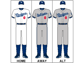
4. Los Angeles Dodgers
If the numbers on the front weren’t there, this jersey would rank low. However, the pop of red that mixes up this jersey is perfect. Classic jersey, classic logo: perfect for the team.
3. Detroit Tigers
The Tigers have the best logo in baseball, and the beautiful, calligraphic D is properly highlighted on the jersey. The logo itself rescues the jersey from boredom as there’s not much there aside from that good-looking letter. It’s just such a nice logo.
2. New York Yankees
“You know why the Yankees always win? Nobody can keep their eyes off the pinstripes.” While that may not be true, the quote from “Catch Me If You Can” still stands. The Yankees have beautiful, classic jerseys that haven’t been tampered with, for there’s really no need to change anything when they’ve got something this great.
1. Boston Red Sox
What makes the Red Sox home jerseys the best in the league? There’s nothing wrong with them. At all. They are perfection in a uniform. The logo, the number, the lack of names, the wordmark, everything. Simply beautiful.