Matt Unger – Simpler design honors a century worth of history
With the men’s basketball team in its 100th year of collegiate play, many speculated that new jerseys were in the works. Just a day before Marquette Madness, Deputy Athletic Director Mike Broeker tweeted out a teaser photo confirming just that. “A sneak peek at our new uniforms” he tweeted out (and yes, he used the fire emoji to describe them).
Initially I was quite skeptical of the idea of new jerseys. The most recent batch of uniforms, which have been worn since 2011 (or 2007, if you’re not counting the minor update in 2011), has tremendous brand recognition. Truthfully, there is nothing quite like them. From the color schemes to the “rainbow” of navy, gold and championship blue down the side, Marquette basketball was instantly recognizable by their jerseys.
That’s where the challenge came in for Marquette athletics. How would they create new jerseys that pay homage to their 100 year anniversary while keeping that unique Marquette brand? Much to my surprise, I think the athletic department nailed it.
While the 2011-2016 uniforms created brand recognition, I was not a fan of the overall design. I personally think the jersey and short combination is too busy for the eye. These new jerseys are simple, but effective; they are eye-catching, yet not overwhelming.
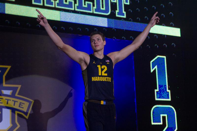
Overall, I like the classic, clean look that athletics settled on. The light stripes that run horizontally down the entire uniform are subtle but pleasing to the eye. Bolder yellow/gold stripes run down the side of the jersey and complement the navy. The side stripes give the jersey a noticeable pop, just like the famous “bumblebee” jerseys from the early 1970’s.
I also love the “belt” that connects the jersey top to the shorts. A faded gold color extends around the entire waist of the shorts until a “buckle” in the front connects it. The buckle, which is a panel of gold and championship blue, pays homage to the rainbow design of the previous jerseys.
The strategic choice to honor the untucked jerseys is also reflected in the new design, where the player number is actually located above the school name. This minor detail may not seem like much, but it does give the jersey a throwback feel.
Marquette basketball has a proud history over these last 100 years and there is no better way to honor the past century than with some sweet new jerseys that blend old and new. I can’t wait to see the gold, white and championship blue versions.
Jack Goods – The new jerseys move away from Marquette’s identity
When the men’s basketball team entered the Al McGuire Center court in their new uniforms, I was shocked by how big a change they were. To me, that was a huge disappointment.
I understand what the athletic department was going for by including aspects from jerseys of the past. It was clear the subtle white lines resemble the bumblebee jerseys of the early 70’s. The “Marquette” wordmark below the numbers looks like the team’s untucked jersey. There are two of the Marquette rainbow stripes on the waist. On paper, I like the mindset they had about celebrating the history of the program in its 100th year of existence.
However, I’m not crazy about the execution. Many of these touches are rather hard to notice from far away, especially the white stripes. They are so subtle (they need to be to meet NCAA standards) that you couldn’t see them in the crowd at the Al McGuire Center, let alone from seats at the BMO Harris Bradley Center.
Zoom out from the jersey and suddenly it looks like a plain navy jersey. With the previous branding it was easy to spot a Marquette jersey since they were so bold and unique. Now, I might have to get a bit closer to figure out if it’s Marquette, Michigan or Cal.
If these jerseys were for a brand new program, I probably would like them a lot. Unfortunately, it feels like the uniforms are abandoning the current brand of the university. The Marquette rainbow is what sets Marquette apart. It’s made its way to the women’s basketball and men’s lacrosse jerseys. It’s even on the quidditch jerseys. But now it’s a tiny accent on the jersey of the school’s major money maker.
Will these uniforms grow on me? Probably. However, for me it isn’t as much that these are the jerseys Marquette wears now. It’s that they no longer will be wearing the ones that scream Marquette.