
https://soundcloud.com/marquette-radio/marquette-architecture
Here’s a fun fact: every residence hall at Marquette was built before humans stepped foot on the moon. How about this: the newest residence hall at Marquette is McCormick. You know, the dorm that’s being torn down in the near future.
Let’s start with that magical circle of a building, McCormick. Colloquially known as “the beer can” due to its beer can-like appearance, McCormick was built in 1967, and it shows.
Apparently, architects in the 60s hated things like 90 degree angles and logical design choices, and because of that, Marquette is stuck with this building that looks like a soup can with part of the side taken out.
What McCormick Hall is to first year students, Schroeder Hall is to sophomores. While Schroeder doesn’t look like a bottle of shaving cream, that does not mean that it looks good. Are you a fan of rectangles? Congratulations, this is the dorm for you! Rectangle Hall is so uninspired in its design, I had to look up pictures of the building online to remember what it looked like— and even then, I wasn’t totally sure that I was looking at the right building.
O’Donnell Hall is an equally uninspiring rectangle. The design of the building requires anyone who wants to enter to walk in between two sides of the building to reach the front door. That’s a fine enough design choice, one that at least separates the hall from the other residence halls on campus.
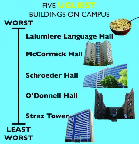
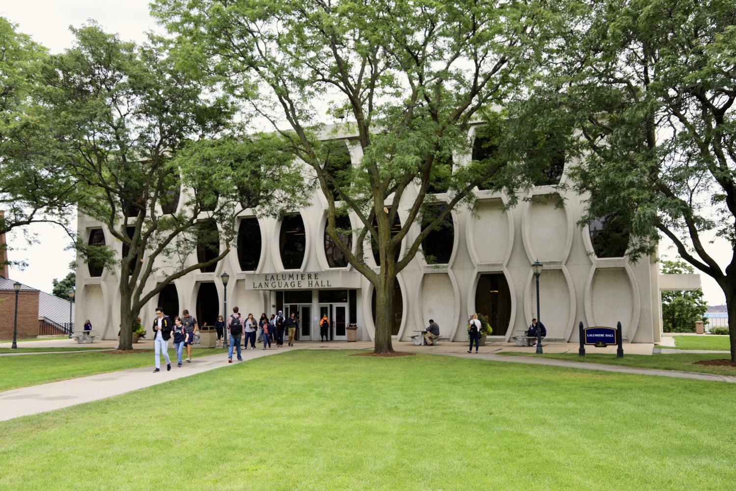
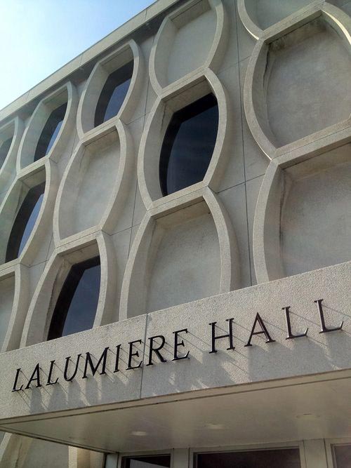
Have you ever seen something that makes you so angry that it inspires you to write a column about it? That’s what Lalumiere Language Hall did to me. It’s not a dorm, but its design is so disgusting that it warrants a mention. The building, which looks like something that a kid would make with her Honeycomb breakfast cereal, is the ugliest building I have ever seen. The windows are a weird oval shape and seem to be spaced randomly around the building. The building itself, with its entirely concrete structure, is an icky gray color. Just thinking about the building makes me angry.
Abbottsford Hall resembles a hotel when you look at the first floor, but if you look up at all, it looks like a prison. Straight lines are the major design choice in this residence hall, and the windows appear as though they have a prison bar in the middle of them to stop the residents from escaping. One thing that sets Abbottsford apart are the two black columns lining the 13th Street side of the building. While they make it seem like the builders ran out of bricks and had to finish the building with whatever black plastic they could find, they at least add something different than just red brick.
Speaking of reminding people of hotels, both Cobeen aall and Mashuda Halls have that distinct hotel look about them. That’s because both were hotels before Marquette purchased them. If I didn’t know they were residence halls, I would think they were hotels based on the outside appearance. Cobeen has a neat little stripe of white brick running down the front of it, and it sort of has the appearance of a castle, which is a beautiful design choice. Mashuda, on the other hand, looks like a structure built to sustain high flooding, with many of its rooms held up on stilts. While it may seem like an odd design choice, I’m not against it. The stilts are something different, they aren’t red brick and Marquette could always use fewer buildings made entirely of red brick.
Humphrey Hall is entirely red brick. It was formerly Milwaukee Children’s Hospital, so it looks the part. There is not much to say about it. Humphrey is perfectly average. The unused old front entrance is interesting because it looks like the entrance to a creepy old haunted house, but that’s the only discernible personality that the building has.
Straz Tower has no red brick in it— that’s a plus. It also has no personality to it— that’s a minus. It is difficult to critique a building that has no interesting features about it. It’s … tall. It’s like trying to critique vanilla pudding. It’s bland, but if there is some in front of you, you’ll eat it. That’s what Straz is.
I saved the best for last because Carpenter Tower is a beautiful building. The art-deco design is straight from the 1920s, and while it is a predominantly-red brick building, it has enough variation to make the residence hall stand out. The white stripe of brick from Cobeen is featured on the facade of Carpenter as well, but this time, these stripes line every corner of the building. The roof of the building is also lined with white brick that makes the building instantly stand out. It’s just a gorgeous building and one that always makes me smile when I look at it.
Most of the residence halls at Marquette are uninspiring. If they’re not red brick buildings, they’re relics of 60s architecture that stand out like sore thumbs in the modern world of building design. There are some good-looking buildings, like Carpenter Tower, but there are also some real stinkers, like Schroeder Hall. But none of the residence halls look as terrible as Lalumiere does, and if that’s not a good thing, I don’t know what is.


Dan • Sep 17, 2017 at 7:41 pm
While I mostly agree with your analysis, I think it rather a stretch to examine the architecture of dormitories. Their purpose isn’t exactly to look nice, but to house students and house them cheaply. Uninspiring lowers maintenance/construction costs. Also, I wouldn’t think it is good journalism practice to use an article on dormitory architecture to present your personal bias of Lalumiere’s architecture (which seems to get criticized annually). Some might say that, ‘the building, which looks like something that a kid would make with her Honeycomb breakfast cereal, is the cutest building I have ever seen. The windows are an epic oval shape and are creatively spaced around the building. The building itself, with its entirely concrete structure, is an suave crème color. Just thinking about the building makes feel me like I’m headed into a bright future.’