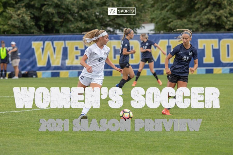
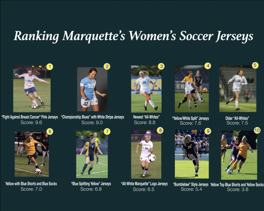
While it’s not a scientific fact that if you look good, you play good, jerseys are a massive part of a team’s identity. Some teams take massive pride in certain jerseys but every team tends to have a unique look that makes them different. For Marquette women’s soccer, the jerseys have been unique and have changed with the times. Here are their top 10 jerseys over the years, as ranked by members of the team and media:
1. “Fight Against Breast Cancer” Pink Jerseys
Although they’re only taken out once a year, this unique uniform is a player favorite. Redshirt junior midfielder/forward Meredith McGuire said these jerseys have a special meaning along with one of the best color schemes.
“Anything to support something like this, I’ll love no matter what,” McGuire said.
Positives: Color, Style, Fit, Cause
Negatives: Need White Shorts, Newer Font
Score: 9.6
2. “Championship Blue” with White Stripe Jerseys
The light blue jerseys ranked among the best for the unique style and color combination. The only negative came from the shorts. Sophomore defender Madeline Warren said that the shorts and the font took away from the jersey.
“I really like the jersey. I like the color and it’s modern, but ruined with the shorts. We just got new shorts that everybody really likes better,” Warren said. “I would also say if you’re going to put a number on the shorts, make it small. I don’t think, on the shorts, a number is needed unless it’s for identification, so if you have to, make it smaller.”
Positives: Color, Style, Modern
Negatives: Shorts
Score: 9.0
3. Newest “All-Whites”
“These are ideal,” Warren said.
With the newer font, hinting back to an older jersey, the new all-whites are a favorite among the players. The jersey has a minimalistic feel with a font that is reminiscent of professional jerseys.
“These are the newer shorts and they fit so well. Everything fits everyone,” McGuire said.
Sophomore forward Shelby Fountain said the jerseys might be on her wishlist with the other Marquette colors.
“These are definitely ideal. I want it in every color,” Fountain said.
Positives: Color, Style, Modern, Shorts, Fit
Negatives: N/A
Score: 8.8
4. “Yellow/White Split” Jerseys
Diverting away from the all-white home jerseys, these yellow and white split jerseys offer a unique look. The design has an all-yellow back but splits to white on the front. The shorts, again, are the one part of the jersey that does not quite fit.
“I like the top, but the font is different on the shorts,” Fountain said.
McGuire echoed the same feelings as Fountain.
“The only thing that kind of irks me is the shorts. With this one and the championship blue, I really like the top,” McGuire said. “The shorts are just kind of off.”
Positives: Style, Modern, Coloration
Negatives: Shorts
Score: 7.6
5. “All-Whites” (Older Version)
These jerseys seem to be the blueprint for the newest all-white jerseys. The retro font along with the interesting style make these jerseys a player favorite.
“I love this jersey; I think it looks cool, timeless,” Warren said. “I like the long sleeves because they’re not tight and you can move in them.”
McGuire said the jersey has a little bit of everything which adds to the look.
“This one is very appealing to the eye. You have everything: Nike with the sponsorship, Marquette on your side, and having white at home, I think that’s a statement,” McGuire said. “I love this jersey; this was one of my favorites.”
Positives: Minimalist, Style, Color, Fit, Sleeves
Negatives: N/A
Score: 7.5
6. Yellow with Blue Shorts and Socks
Part of the current regiment of uniforms, these yellow jerseys became much more appealing with the blue shorts and socks. The primary colors together is prime Marquette. Although yellow jerseys are seen less often, the pairing of the yellow and blue gives this newer style of jersey an old-school feel.
Previously, Marquette had paired the yellow jerseys with white shorts and socks.
“I like the jersey much better in this than with the white shorts and socks because the color on the shorts matches the number of the jersey,” Warren said.
Marquette also added the conference logo on the side of the jersey, which McGuire pointed out.
“I also really like the BIG EAST logo on the shoulder. It kind of makes it more of like a unit with Marquette and BIG EAST,” McGuire said.
Positives: Color Pairing, Fonts Match, BIG EAST Logo, Fit
Negatives: N/A
Score: 7
7. “Blue Splitting Yellow” Jerseys
These intriguing jerseys see a design featuring a large blue column down the middle with yellow sleeves and sides. Although the colors represent Marquette, the jerseys leave the Marquette logo off, and it instead appears on the shorts.
The more modern concept made the jerseys rank highly among players, although the tight fit of the tops and bottoms dropped the overall score.
“I love the shorts, they’re a little more square. I just remember the jerseys were tight,” McGuire said.
Warren also appreciated the design but reiterated McGuire’s feelings about the fit.
“I think it looks like a nice outfit but when everybody was putting them on, everybody’s shirts were too small and the shorts were way too small,” Warren said.
Positives: Coloration, Matching, Style
Negatives: Fit
Score: 6.8
8. “All-White Marquette” Jerseys
These jerseys used the old-school Marquette lettering across the front of the jerseys. The matching fonts on the tops and bottoms gave this jersey a very complete look.
“I think this looks like an actual jersey. I like the short sleeves, it looks like it fits nice and I’m a big fan of the all-white jerseys,” Warren said.
Fountain agreed, pointing out how the older white jerseys pieced it all together.
“I like the whole white outfit and the font is really nice, the Marquette logo, just everything,” Fountain said.
Positives: Color, Logo, Font, BIG EAST Logo
Negatives: N/A
Score: 6.5
9. “Bumblebee” Style Jerseys
The navy blue design with yellow stripes was not quite as popular among players. The horizontal stripes, often found at the professional level, appear a little too small on this jersey. The jersey seems to be a shoutout to Marquette’s 1969-72 men’s basketball jerseys, but just misses the mark.
“The font makes it look so old and gives me more of a rugby vibe,” Warren said.
McGuire said the jerseys could look good for a different time but they weren’t meant for them.
“It’s just not really our style. We might’ve worn these my freshman year. It’s more of a men’s soccer-style,” McGuire said.
Positives: Matching
Negatives: Style, Font, Colors
Score: 5.4
10. Yellow Jerseys with Blue Shorts and Yellow Socks
Although it has the same top as used previously, the shorts and socks combination landed this uniform at the bottom of the rankings for the team. The same jerseys with blue shorts and blue socks give off a much more aesthetic look, while the yellow-blue-yellow makes this uniform much less appealing.
“The lines are just not right. It just feels a little broken,” Fountain said.
Positives: Colors, Fit, Style
Negatives: Color Matching, Shorts
Score: 3.8
This story was written by Bryan Geenen. He can be reached at [email protected] or on Twitter @bryangeenen.