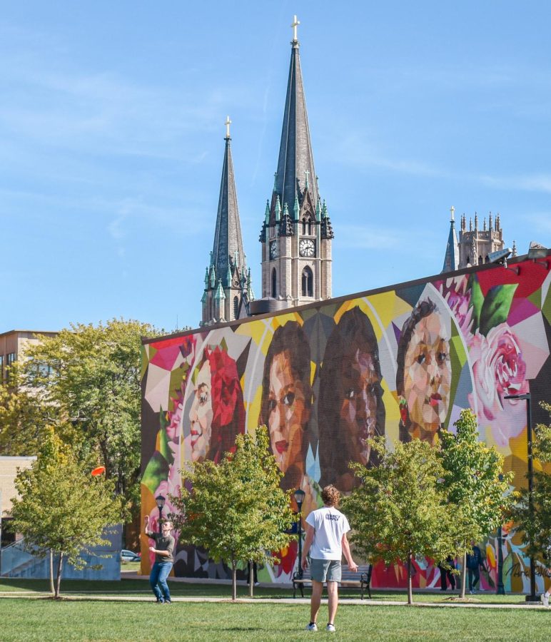
A vital part of human life that helps us to feel, remember and act is disappearing from our world. It should alarm you when I say that color is disappearing from our world. I mean, literally disappearing.
Artificial Intelligence research conducted through a survey of thousands of items dating back to the 1800s found that 200 years ago, 15% of our world was dominated by gray. Today, it is now at 60%.
Everyday life has blurred together in hues of beige, black, white and gray. Our world has slowly spun away from the vividness of complex color schemes and settled on monochromatic, dull neutrals. Fashion trends have now dictated that we live boring, colorless and minimalist designs.
Minimalism is in, prioritizing sleekness and, apparently, a lack of style.
Our market is saturated with items that can be easily consumed by the masses, such as buildings, clothing and electronics. These items have little to no defining shades of difference, as it is easier to appease when there is no garish details to view.
Look no further than our landscape and your surrounding area to see the ironic angelic harmony of neutrality.
Our lack of color and creativity tints the current Milwaukee skyline. Take one look at the Northwestern Mutual building, University Club Tower, the U.S. Bank Building or Kilbourn Tower and you will see glass, grey and white in a stick straight fashion. There is nothing architecturally stimulating about these buildings which blend together through unremarkable, modernist design choices.
Architecture is not the only art form minimalism has fallen victim to. Top designers such as Yves Saint Laurent and Balenciaga have redesigned their iconic logos into what looks like a standardized, bolded font on Microsoft Word. Previously, designers crafted logos that were unique. Burberry London once looked classic and feminine with a looping font that felt effortlessly elegant. Yves Saint Laurent held an edge with sharp letters, poking with a European chicness to elicit feelings of prestige.
There lacks individuality in colorless minimalism.
MacBook valued an extremely different design in the early 2000s with big, bulky colors of blue, orange and pink. Apple, like the rest of society, lost their vibrancy. The design for MacBook has evolved into a minimalistic design with a gray body, black keys and a white logo.
With my laptop, I do everything I can to separate myself from the current design.
On top of my MacBook, I have stickers that range from the poster of David Bowie in Labyrinth, skeletons, climbing brands, places that I have visited and an Otter dressed in Ottoman Empire armor. It is a mess of colors; it is a chaotic jumble of things that represent me.
Creativity starts with color.
Across the spectrum of color, the largest impact it has is how to shape our perceptions. Color, chaos and creativity are stimulating and vibrant to our experiences as an individual. A world without color would be expressionless. It wouldn’t make us angry, happy, sad, surprised. It would make us neutral: numb.
I don’t want to live in a world where I feel nothing.
Color is so intrinsic to our livelihoods, our individuality and our identity.
One of the first things we are taught as children is how to identify color. We are asked what our favorite color is throughout our life. We dress in colors that complement our features. Memories and dreams are colored by the vivid hues of our past, present and future.
Our everyday is surrounded by objects geared to stimulate our lives, yet fewer are continuously designed to be visually stimulating.
Color is disappearing by our own choices. Bland objects are easier to look at, they’re easier to forget about. It is time that we forget about ease and colorless cohesion.
It is on us to make active choices about our environment to bring color back before it fades. We deserve to live in a world painted with color, complimenting our experiences as human beings.
This story was written by Laura Niezgoda. She can be reached at laura.niezgoda@marquette.edu.


