For the fifth year in a row, the Marquette spirit shop released its growingly popular ugly Christmas sweater. In honor of the fifth anniversary, I’m reviewing, critiquing and rating each design on a scale of 1-5 Starbucks peppermint mochas.
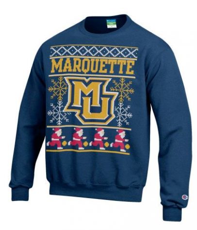
2013 was the trial year for the Marquette Christmas sweater, but the spirit shop ended up delivering a gift that surpassed everyone’s expectations.
“The first year we did it was the most popular,” Larry Birkett, the associate director of the spirit shop, said. “It was probably because it was the first time we did it, but Santa playing basketball is cool. It puts it over the top.”
When attempting to make a quality Christmas sweater, the most important detail is the balance.
“There’s a fine line between too nice and too ratchet ugly,” Patrick Hardie, a junior in the College of Communication, said.
In my mind, this sweater hit the perfect mark. The spirit shop didn’t want to make a sweater that was so ugly it could only be worn once at a party. That would set a bad precedent for the future. Instead, they took a typical Marquette sweater and added enough Christmas to morph it into a holiday hit. Birkett is right. The dribbling Santas takes it that perfect little bit over the top to make it shine.
4 out of 5 Starbucks peppermint mochas
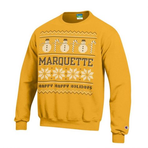
I understand the thought process with this sweater: Since the previous year’s was blue, this one has to be gold. But trying to craft a Christmas sweater with a yellow base is a big mistake.
Yellow is an inherently dominant color on any article of clothing and is best used as a highlight. When I look at this sweater, all I see is bright yellow. I lose the details of the snowmen and snowflakes, and the dark, blocky text is boring and forgettable.
And, this sweater has no depth. Looking at the structure, everything is in a line. From top to bottom, it’s a line of snowmen, a line of text, a line of snowflakes then a line of text. The only element used to break up the segments is additional straight lines.
In last year’s, the middle MU logo with the back-set snowflakes provided an interesting centerpiece for the eyes, but 2014’s edition featured monotony through and through. After this, I put on my cap and prepared for a long winter nap.
For further proof, when I asked Birkett to critique the past designs, this was the only one he had no recollection of at all. It was completely forgettable for the man who runs the store.
1 out of 5 Starbucks peppermint mochas
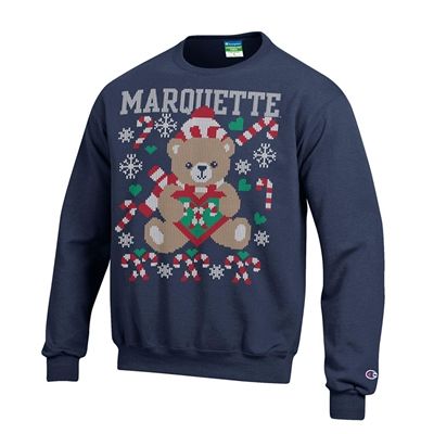
The spirit shop returned to the top of their game in 2015, and intelligently went outside of the box to do it. Since the first two sweaters were heavily Marquette themed, it made sense to take a step back and provide a different subject to re-interest the students. They didn’t want to turn the Christmas sweaters into any other generic Marquette sweater, and the focus on the teddy bear kept the idea of an ugly Marquette sweater fresh and compelling.
“The one with the bear on it, was pretty ugly. Well, pretty cute and ugly at the same time,” Birkett said. “It was definitely the kitschiest, but when I say that, I think I mean it’s the best one. It’s the ugliest. I mean, that’s the goal, right?”
Hardie agreed with him.
“A great example of a good Christmas sweater is the one in the spirit shop with the teddy bear on it. That’s a fantastic Christmas sweater,” Hardie said.
5 out of 5 Starbucks peppermint mochas

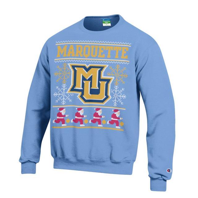
Last year’s sweater is all about tradition. To honor 100 year’s of Marquette basketball, the color palette mocks the 1977 national championship team that wore powder blue and gold. The design harkens backs to the original sweater released in 2013. In a school year that was all about connecting the past, present and future, this sweater was perfectly designed.
“I like this year’s (2016) a lot,” Birkett said. “It looks pretty sweet, and I think the colors pop.”
He’s right — the colors really leap off the page, and the yellow is excellently used to highlight the logo on the soft, blue base. Also, the dash of red from the Santa Clauses draws the eye and adds another element.
The one knock I have on this sweater, would be that they played it way too safe, but I understand why they did. Alumni were returning to campus that winter to celebrate Marquette basketball’s 100 years, and while they’re here, they’ll want to load up on gear from the spirit shop.
The shop wanted to go with a design that they knew would sell, so it went back to the most popular. If they would’ve taken too big of a risk and it didn’t pan out, they would lose out on a big payday.
Personally, I’d rather see an original design every single year, and the sweater a bit more customized for Marquette itself. Maybe they could’ve done an homage to the untucked jerseys by putting Marquette at the bottom.
3 out of 5 Starbucks peppermint mochas
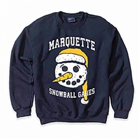
When I first saw this sweater, I was absolutely baffled. I had no clue what the snowball games were, or why a snowman with an incredibly long winter hat and no hint of festive cheer was soullessly staring at me through the seams of a once joyous holiday pullover.
After looking online and researching the snowball games, I still have no answer.
This sweater reminds me of the red Starbucks cup controversy in 2015. They took the Christmas out of the sweater. Every single sweater prior has been Christmas-themed with a mention of “Happy Holidays” or a picture of Santa dribbling a basketball, but this sweater is bland, boring and simply not festive.
Through my four years, I’ve purchased two of the sweaters. I bought last year’s because the color scheme was eye-popping, and it was a nice homage to the original sweater during a year filled with 100th-anniversary tradition. I also bought the sweater with teddy bears, because I love teddy bears.
However, I can’t possibly think of one reason that I, or any other student, would purchase this sweater. The text is irrelevant and the design is boring and bland.
-1 out of 5 Starbucks peppermint mochas


